Author Archives: Brad Dworkin

FAT – TIFF Review

image

When Kevin Smith made his first film Clerks, he tapped into the zeitgeist, chronicling the story of two slackers. The reason it worked wasn’t because it was funny, which it was, nor was it because it showed technical prowess or visual mastery, which it didn’t. Clerks was a game-changing film for Smith because it tapped into a kind of story that was severely lacking from the cinema. For all their roughness, the characters spoke to something universal that we all seemed to know about life. It’s with a similar honesty that comedian turned director Mark Phinney brings us his directorial debut, FAT.
Now, I don’t mean to lump these two films together. First of all it’s important to note that FAT is not a comedy. It’s an unflinching story of a man dealing with his overeating and the way this affects his life, his relationships and friendships. With an incredible nuanced performance by Mel Rodriguez, FAT tells the story of Ken, an overweight man who refuses to change his lifestyle. So many movies play overweight characters for a cheap laugh, not so in FAT. The documentary style camera never strays from the tougher moments in the film. We watch as Ken faces the challenges of something as simple as getting ready in the morning, or attempting to sleep without the assistance of an oxygen mask. We agonize with the character as he spirals into self-loathing, stopping at several drive throughs over the course of the film. We root for him, feel his frustration and accept that, unlike most hollywood films, there is no easy answer to his complex problems.
For all of its brilliance and genuine emotion, it pains me to think that so few may see this film. It’s shot with all the subtlety of amateur home video. The footage stutters and smash zooms through each scene as if the DP had no idea what was going to happen. It’s hard to accept as an aesthetic and feels mismatched to the story being told. Luckily for Phinney, the film’s virtuosic lead performers soon make you forget about all of it, no small feat. I hope some distributor out there has the balls to take a risk and get this film out there. Obesity is an ever increasing part of our society and a film like this deserves, nay, needs to be seen by as much of the population as possible.

4.5/5

Palo Alto – TIFF Review

Image
Gia Coppola faces a considerable challenge with her directorial debut Palo Alto. Not only in the challenge of the source material, but also by stepping into a legacy established by her not-unremarkable family. The niece of Sofia, the grand-daughter of Francis, Gia’s youth and inexperience offer the promise of a fresh voice, but unfortunately Palo Alto never quite lives up to expectations. One must wonder whether self-proclaimed renaissance man James Franco’s short story collection upon which the film is based, offered her much in the way of opportunities as she adapted it for the screen.
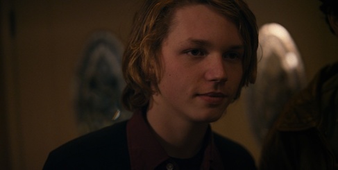
Palo Alto focuses on a group of teenagers dealing with the malaise and confusion that comes from the potent mix of life-changing decisions and their raging hormones. Despite a star-making performance from new-comer Jack Kilmer as Teddy (the son of Val Kilmer, who also appears in a cameo), and passable support from Emma Roberts as April, the film gets bogged down in easy clichés and awkward filmic devices that seem designed to make up for a lack of footage in the edit suite. A major conflict between two characters is played out in a sloppy voiceover as we watch them smile and cavort in a sunlit field. When they begin to fight in a later scene it seems to come from nowhere. The stakes just couldn’t be lower for the young protagonists.
Gia Coppola leans heavily on the style established by her aunt in Virgin Suicides, lingering on sunlit suburbia and long pensive moments, but it ultimately comes off as inauthentic, a cardinal sin for a film which attempts to speak to youth as much as speak for them. She fills the film with a collection of bit players who almost destroy any emotional weight in the film (there’s really no such thing as a small part). When Teddy finds himself in a car accident, the shrill awful line reading of the victim as she shrieks “it’s just a kid!” was almost drowned out by the collective sound of rolling eyes in the theatre. I wish I could say that a single major set piece in the film went unmolested, but sadly every single “poignant moment” featured some lapse by way of jarring editing, terrible acting or just uninspired dialog.
Story structure similarly suffers as moments of foreshadowing are dropped seemingly from nowhere, only to be resolved second later. Teddy offers to April that her last cigarette should be used to make a wish, and moments later a collection of kids appear out of nowhere to ask for every cigarette in the pack, leaving her with the one cigarette she needs to wish for what she really wants. It’s just too obsessed with wrapping up the bigger themes with a neat little bow, at the cost of becoming absurd.
Near the conclusion of the film, April muses that she wishes she could go back a year so that she could undo everything that had happened. Ultimately the film treats everything with such a lack of gravitas that we don’t really feel like she’s been through much.
2/5

Film Look: When Digital Plays Dress-up

Why do maple syrup bottles have those little useless handles on them? It sounds like a joke from the opening monologue of Seinfeld. It’s the same reason we “turn on” our TVs (with nary a dial in sight). The answer, is because it’s a skeuomorph. What does this have to do with film? Who are you? Why are robots stealing my medicine for fuel?!  First, a definition.

This man has the answers… All will be revealed

SKEUOMORPHS, HOW DO THEY WORK?

A skeuomorph is a decorative feature of an object or design that once served a purpose, but now hangs around for purely aesthetic reasons. Think about the rivets on your jeans. They aren’t holding anything together.

Still beats Jeggings.

Think about the notepad app on your iPhone, why does it need to look like lined paper? We’re used to seeing it a certain way, so the designer includes these cues to the past to make us comfortable. Maybe you need a more relevant example? How about a $1 billion dollar one?

 INSTA-WHAT?

Instagram is an instant photo sharing app that has been in the news lately for a lot of reasons, not least of which that they were sold to Facebook for around the same amount of money as the total grosses for The Dark Knight.

or roughly the same cost as a few of these.

It doesn’t make your camera better, or improve image quality, it makes it look like it was shot with film stock that has gone bad, bucket processed and in a plastic camera with a cracked plastic lens. It looks “vintage” or “retro”, but what it’s really doing, is emulating a time when photography was a photochemical process. It’s a skeuomorph. Starting to get the idea?

Look at this !@#$ing hipster!

 CINE-LIKE

Sony introduced digital video commercially in 1986 with a tape format called D-1. Yadda yadda yadda, digital cinema. Right? Well, not exactly. Video carved out a niche in live television programming and news while film kept its stranglehold on narrative films and TV.  I’ll skip ahead a bit to where it gets interesting for indie filmmakers. In 2003, Panasonic released the Panasonic AG-DVX100. The first progressive-scan, 24p digital video camera. Designed for indie filmmakers who couldn’t afford to shoot on film. It was a hit. It took until they started making video look like film, something we all associated with visual storytelling for it to find a market. Suddenly we were bombarded with words like “Cine-gamma, cine-like, movie-mode”. It was about realistic film grain and motion blur, things that aren’t natively inherent in video. Aesthetic features, not a necessary function of the chemical process of film.

 WHERE ARE WE NOW?

Canon took over the indie market with DSLR’s that gave a film-like depth of field. RED has been praised for their film-like contrast curves and stops of information, but we’re still working our butts off, post-processing in programs like Magic Bullet suite to make digital play dress up. Pretending to make it something it’s not. There are exceptions. Michael Mann’s grainy video-look in “Miami Vice” and “Public Enemies”, Richard Linklater’s meta-titled “Tape”. And then there’s Peter Jackson and James Cameron. Jackson, on the advice of famous diver James Cameron (I think he occasionally does films too), shot his latest Lord of the Rings opus “The Hobbit” at 48 frames a second. That’s double film’s standard 24fps. He broke the rules! That’s not the skeuomorph people are used to. And he’s hearing about it.  Variety said:

“48 fps has an immediacy that is almost jarring. And lighting it just right will be a learning process, as 3D was and still is. 48 fps also, unfortunately, looks a bit like television.”

There’s no reason digital video needs to look like film, it was just a design cue we were all used to. Having not seen this footage, I won’t pick a side. I will however say this. Breaking away from 24fps is a major shift for the industry and for audiences. I don’t think 48fps will hold as the clear winner, nor will 60fps, or any other frame rate. I think we may see a future where the frame rate of the footage is dictated by the nature of the content. Romantic character films in old school 24fps, action films at 60fps, maybe even slapstick comedies at 10fps like an old  Buster Keaton film?

What do you think? Are you happy to be rid of the limitations of an analog medium? Or are you content to keep working on making the new look like the old? Sound off in the comments.